Showing posts with label pink. Show all posts

Friday, 28 February 2014

DIGIT-AL DOZEN WEEK: Vintage Polka Dots

Nothing to Disclose

Hello lovelies!

TWO POSTS IN ONE DAY! I was so chuffed after my last post that I immediately took to Google and found something else vintage-y to produce for you!


This was inspired by this polka dot pattern I found on DeviantArt. I started with a base of Rue (which took three coats to opacity, and was mysteriously sort of lumpy?), and then did dots with Crescent Heights, Where Did Suzi's Man-Go?, and Blowing Raspberries.


After that, I did two coats of top coat to protect the base, and did the 'watercolour' technique with Chelsea Physic Garden and Moody Blues. I then sealed everything in another coat of top coat. And then bumped my index and thumb badly while opening a bottle of wine. (This is, in a nutshell, everything you need to know about me.)


Polishes used:
Zoya - Rue
American Apparel - Crescent Heights
OPI - Where Did Suzi's Man-Go?
butter LONDON - Blowing Raspberries
nails inc. - Chelsea Physic Garden
Duri - Rejuvacote (base coat)
dotting tool
square brush for 'watercolouring'

I like this effect, it's like a kind of verdigris... I look forward to doing it over more complicated patterns, probably using jellies next time for optimal ageing.

AND I FINISHED! AND IN THE MONTH OF FEBRUARY! I'm so pleased. Thank you, Dionysus, for all that you do.

xo,

J.

CHECK OUT WHAT THE OTHER TALENTED LADIES OF THE DIGIT-AL DOZEN WERE UP TO:


Tuesday, 11 February 2014

DIGIT-AL DOZEN WEEK: Vintage/Shabby Chic Floral Wallpaper

Nothing to Disclose

Hello lovelies!

Lookit this! An on-time post!


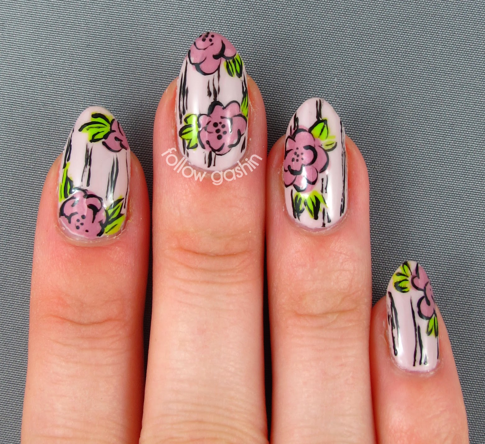
Debbie did a floral wallpaper-type design yesterday, and I had recently seen Katy's invention of this design over at her blog, and I was inspired to give it a shot! It is something of a "second-class" design for me because I didn't invent it myself, but I'm trying to give myself a break this week. :)


For this design, I started with three coats of Don't Bossa Nova Me Around, from the new Brazil collection. It went on pretty smooth, but needed 3 coats for opacity. I then painted the roses with Poco a Poco and the leaves with Crescent Heights (I wanted to use CG's Budding Romance but my bottle won't open and I'm an impatient human being).


I then took my tiniest detail brush and went in with Camelot to do all the lines. In retrospect, I should have used Revlon's Dominate (my go-to dark brown) because it would have added to the vintage feel. I'm kicking myself over it a bit.


Polishes used:
OPI - Don't Bossa Nova Me Around
Rescue Beauty Lounge - Poco a Poco (no longer in production)
American Apparel - Crescent Heights
Duri - Rejuvacote (base coat)
medium detail brush
tiniest detail brush

Today I was called into the office of the place I'm trying to work for, to meet the other admin assistant who currently works there. It was super nice, she's a total sweetheart. I know they have yet to call my references, and I'm hoping that goes well... but I'm otherwise feeling a bit better about my prospects now. :) Yay!

xo,

J.

CHECK OUT WHAT THE OTHER TALENTED LADIES OF THE DIGIT-AL DOZEN ARE UP TO:


Sunday, 19 January 2014

SIMPLE SUNDAY: Retro Fishtail

Nothing to Disclose

Hello lovelies!

SURPRISE! I have a post for you! I am probably on a plane right now, but I wore this look for a dinner out on Friday and I decided I wanted to share it with you.


PINK NAILS PINK NAILS WEE OO WEE OO. Seriously I don't think I've had pink nails since I was 10. I'm calling this a retro fishtail because the colours seems very... "70s wallpaper" to me.


This started with three coats of Mt Augustus (which is paler in real life, sort of a bright pastel pink with coral leanings), followed by two coats of Pastille for the upper fishtail, and one coat of Educate for the lower fishtail. Some studs, and done!

This shot gives you the shimmer in Mt Augustus, the holo in Pastille, and the green flakes in Educate.

Polishes used:
Elevation Polish - Mt Augustus (which I think got discontinued?)
Mentality Nail Polish - Pastille, Educate
Duri - Rejuvacote (base coat)
1.5mm studs from Born Pretty Store

Okay, now FOR REAL I'm leaving you all for a week. You can follow my adventures on Instagram, I'll try to post interesting photos about my trip there!

xo,

J.

Tuesday, 14 January 2014

DIGIT-AL DOZEN WEEK: Monochrome Honeycomb Ombre

Nothing to Disclose

Hello lovelies! Whew, what a mouthful today's title is. And it proved to be the hardest-to-photograph mani I've ever done, too! I had to set the white balance WAAAY off to even get the differences in the colours to show up at all.


Waugh! It's a shame, because it's a lovely mani in person. (You'll just have to take my word on it.) It's an ombré of pink/orange/coral tones. I started by painting my nails with, from pinkie to thumb, 1963, Generally Hazzardous, My Paprika is Hotter Than Yours, 724, and Jinx.


I then 'bumped' each colour over by a finger (e.g., used 1963 on top of Generally Hazzardous) in order to draw the honeycomb shapes. It turns out I'm crap at honeycomb, so I'll have to practice that more. :)

This is as close to a colour-accurate photo of the polishes as I was going to get:


Polishes used:
OPI - My Paprika is Hotter Than Yours, Jinx
Inglot - 724
Duri - Rejuvacote (base coat)
medium detail brush

I love love love this colour family but it's impossible for the differences to show up on camera, or at least, on my camera. Any experiences like that before, for you? So frustrating! Come back tomorrow for a look that at least didn't elude my meagre photography skills...

xo,

J.

CHECK OUT WHAT THE OTHER TALENTED LADIES OF THE DIGIT-AL DOZEN ARE UP TO:


Monday, 6 January 2014

Nostalgia

Nothing to Disclose

Hello lovelies!

I've been largely without inspiration for the past few days. Which is an issue, with Digit-al Dozen week coming up (that was a FAST month)! I did produce a simple floral look, which I posted to Instagram and Facebook. But today I do have something for you!


Yes, more lace moons. But on a multichrome polish called Nostalgia, how could I do otherwise?!

The hair on my nail in this photo and the next drives me bananas. BANANAS.

This look began with three easy coats of Nostalgia, which I did without using black undies. (You don't need them for I Love Nail Polish multichromes, though using them would let you get away with one to two coats of the polish instead of three.) Multichrome polishes can often be underwhelming, taking all kinds of weird hand poses to show a colour shift. NOT THIS ONE. Look at these photos! Swoon!


The design was done using white acrylic paint, which I should have thinned with water but did not, and a combination of a liner brush, a script brush, and a tiny detail brush. It was inspired by this image, which I found on Google. I didn't want to do a more complicated lace pattern, lest I cover up more of the beautiful base polish. Seriously, this one takes my breath away.


Polishes used:
Duri - Rejuvacote (base coat)
white acrylic paint
liner brush
script brush
tiny detail brush

Today we finally got a break in the frigid cold we were having; yesterday it was down to -39˚C with the wind chill (-38˚F). Are you in the part of North America currently being walloped by the huge winter storm? If so, I hope you're keeping as warm as possible! Protect those fingers and toes and noses and ears!

xo,

J.

Thursday, 5 December 2013

Graffiti Gashin

Press Sample

Hello lovelies!

Today's post features a water decal, something new to me! Let's jump right in, I'll explain as I go.


This look is loosely based on a baseball cap I have, which a long-ago ex-coworker of mine painted with 'gashin' in neon pink in a (much better realized) graffiti style. I will never wear that cap, COULD never wear that cap, but I nonetheless love it to bits.


So when David at Moon Sugar Decals, a newer water decal company, contacted me to do a review for them, I hopped on the opportunity to use these spray can decals. I started with two coats of Moody Blues, one of the new piCture pOlish collaboration shades, and then used a cotton bud to daub on white acrylic paint on the pinkie before applying the water decal. Like all water decals, you trim the decal from the page to the size you want it (I cut off the bottom bit so that I could put it on the bottom half of my nail like this), plop it in some warm water, wait about 30 seconds, then fish it out, slide the decal off the backing, and place it on the nail. 


Now, I don't have a ton of experience with water decals, so I'm not sure how most of them are. I found the Moon Sugar decal to have the thickness of a regular sticker, minus the stickiness (obviously). It was therefore a touch rigid, which meant that I had to hold down the edges for a while to make sure they stuck flush to my (rather curved) nail. It took two coats of top coat to smooth it out, but nothing extreme in that regard. The upside to the thickness is that there's no chance of ripping or distorting, which I hear is a thing that can happen with water decals. And removal was pretty easy, but you'll probably want an orange stick to scrape off the plastic film if you're using full-nail decals. 


One of the really neat things about Moon Sugar Decals is that they do custom work! So if you've always wanted, say, your logo, or a particular lace pattern, or miniatures of your favourite (non-copyrighted) artwork, or anything like that -- the sky's the limit!

Here is a macro of Moody Blues to show you that, while extremely subtle, there are in fact tiny pink sparks in the blue glass fleck base:


Polishes used:
piCture pOlish - Moody Blues (the pink bits are way more apparent in the bottle than on the nail)
Nina Ultra Pro - Punki Pink (on top of white, for the lettering)
Duri - Rejuvacote (base coat)
white acrylic paint
cotton bud
Moon Sugar Decals in spray can (they do ship worldwide, and shipping in free/cheap!)
tweezers for manipulating the decal

This was a fun mani to do! Even if I learned that I'm crap at graffiti lettering. I actually enjoy how the G and the A came out, though they aren't very graffiti-esque...

I have a cold, I'm all stuffed up!! It's the worst! Anybody else sharing a similar affliction? I hope you get better soon~

xo,

J.

Thursday, 28 November 2013

SWATCHED: Mentality Candy Jelly Holos

Nothing to Disclose -- kind of (read on)

Hello lovelies! 

Today's post comes as a result of a slight hiccough in order packing. You see, I had ordered a bunch of Mentality polishes, and awaited for them to arrive with bated breath. And then they did! And they weren't my order! It turns out that my box was mixed up with another customer's. Hillary, in an example of exemplary customer service, has shipped me my correct order, and told me to keep these lovely polishes as well (gosh, so nice!!). I figured the least I could do would be to swatch them.

So that I don't repeat myself endlessly, I'll put this all here: all of these are three coats, no topcoat. The formula on all of them was very easy to control and apply (none of these photos involved clean up!! A MIRACLE), but you'll not want to go over your strokes too much or you'll create bald spots. Because these are expressly jelly holos, they are a touch on the sheerer side; Mentality makes stamping holos as well, so if you're in for extreme opacity, you might want to look into those. All of these holos have cosmetic grade holo powder in them, not Spectraflair, so you won't be seeing rainbows in my light box. (Somehow, Mentality themselves have captured the rainbows in their swatches-- they're obviously better at corralling rainbows than I am!) Now, let's dive in!


Bon Bon is a jammy pink with slight berry undertones. I'm not a pink girl but this one is deep enough that I like it. 


Marmalade is an interesting one. In the above photo, it looks decidedly orange, but in real life I found it looked orange with a wee bit of pink to it. It made it much more approachable and wearable than straight orange (I love orange polish, but I know not everybody does).


Taffy is an acid yellow-green. I found this one almost a bit frosty, and it isn't as saturated as it looks in the above photo-- more washed out. I absolutely adore colours like these but they don't play nice with my skin tone. 


Sourball is a grass green with the slightest bit of blue to it, which pulls it away from the 'kelly green' territory and more into 'evergreen'. The weird lumps you see are my fault, I think, for applying the polish too soon after shaking it. Blame the messenger for that one.


Pastille is my faaaaavourite. It's got a wonderful tonal shimmer to it, which I hope you can see above. I love this shade of aqua, it's playful and deep without being straight teal.


Gumdrop is a Wonder Woman blue. This one looks a bit sheerer here than it was in real life.


And finally, Hard Candy is a straight purple. It's much less blue than it appears above; not that it's a violet, but it's much less of a grape. It treads that fine line in the land of purple that my camera absolutely hates. It's also not as dark and saturated as it appears-- it reminds me, if this helps, a bit of a cousin or half-sister to A England's Lady of the Lake.

Polishes used:
no base or top coat

And so there you have it! Don't worry, I haven't forgotten about the nail art I owe you-- I hope to have that up tonight or tomorrow at the latest. Hopefully it'll have been worth the wait! This little exercise gave my newfound appreciation for what swatchers do. It's a laborious process, swatching polish, and it dries the living heck out of your hands. Bow down to the master swatchers, for they live in the land of parched skin and impeccable nail polish application!

xo,

J.

Saturday, 19 October 2013

Puffball Floral

Nothing to Disclose

Hello lovelies!

I present to you today a look I've been wearing for the past few days, and which I only just took off rather begrudgingly...


I took a lot of pictures of it.


It was inspired by @celinedoesnails on Instagram, though her flowers look a lot more like flowers and a lot less like some sort of Dr. Seussian fluffball, as here.


The base for this manicure was three easy, beautiful coats of Kryptonite. I tried a photo in direct light to try to catch the holo particles, but it didn't work so well. Just know that all the little flecks of white are in fact rainbow in real life:


The rest of the design is acrylic paint.


Weird puffballs they may be, but I kind of like 'em!


Polishes used:
piCture pOlish - Kryptonite
butter LONDON - Nail Foundation (base coat)
la couleur couture - 2013 (top coat)
acrylic paints
tiny detail brush

Hopefully I'll have something more seasonal for you tomorrow (I am posting this from the past-- ooOOOooo -- and I therefore have no idea yet how hungover I'll be tomorrow). ;)

xo,

J.

Monday, 14 October 2013

DIGIT-AL DOZEN WEEK: Bathed in Light Skittle

Nothing to Disclose

Hello lovelies! We're onto Day 2, woohoo! (Hey that rhymed...)


For today's skittle, I opted to do the opposite of yesterday's skittle: I chose three colours and used them on each nail, but in different permutations.


I'm not sure how successful I was. I do really like the index and middle fingers, though!


The base colour is Bathed in Light. The main accent colour is Stardust, and the detailing colour is Smolder. Everything was done with my medium striper brush, and freehanded (no tape).


I simply adore using Stardust in manis-- look at the colour difference between above and below! What a gorgeous pink-to-gold duochrome. :)


Polishes used:
Nubar - Stardust
butter LONDON - Nail Foundation (base coat)
medium striper brush

I go back to my initial tactic tomorrow, in a really colourful way-- stop by tomorrow and see!

xo,

J.

CHECK OUT WHAT THE OTHER TALENTED LADIES OF THE DIGIT-AL DOZEN ARE UP TO:


Sunday, 13 October 2013

Breast Cancer Awareness

Nothing to Disclose

Hello lovelies!

October is Breast Cancer Awareness month. This weekend is also J for Jellies in our ABC Challenge. I decided to mix the two together. I present it here because I feel like it's an opportunity for me to address something that bugs me every time this month rolls around: pinkwashing.


"Jolène," you are saying, "what the heck is pinkwashing?" Well, it's the pernicious way in which many companies and organizations pretend to care about breast cancer and breast cancer awareness without, you know, actually doing anything useful about it. Here's a website for you, and it's just the tip of the iceberg. And here are two excerpts from the Advertisements section of the Breast Cancer Awareness article on Wikipedia:

Business marketing campaigns, particularly sales promotions for products that increase pollution or have been linked to the development of breast cancer, such as alcohol, high-fat foods, some pesticides, or the parabens and phthalates used by most cosmetic companies, have been condemned as pinkwashing (a portmanteau of pink ribbon and whitewash).[25]Such promotions generally result in a token donation to a breast cancer-related charity by taking advantage of the consumers' fear of cancer and grief for people who have died to drive sales.[9] 
and
Two significant campaigns against pink consumption are the National Breast Cancer Coalition's "Not Just Ribbons" campaign, and Breast Cancer Action's "Think Before You Pink" campaign. NBCC's "Not Just Ribbons" campaign sought to focus awareness efforts onto substantive issues such as genetic discrimination, access to cancer treatment, patient rights, and environmental breast cancer research.[26] "Think Before You Pink" encouraged consumers to ask questions about pink products (e.g., to find out how much of a donation was being made).[27]


A good example is antiperspirants. Companies continue to manufacture antiperspirants, whose active ingredient has been proven to increase the risk of breast cancer, all while pink-ribboning their overall product line to seem like they care. Here is an article a friend sent me on cause marketing (which covers breast cancer awareness as well as other causes). Stuff like that drives me insane. But I'll stop ranting now. I just firmly believe in conscious consumerism.


This skittlette was done using Flamingo Kisses on the thumb and index (three coat), as well as pinky (two coats). Two coats of She Walks in Beauty were then applied to the pinky. The middle and ring fingers are a pond manicure done using Vitral *** and Tempest, and took a good 5 coats to achieve the opacity you see here -- definitely not meant for that.


She Walks in Beauty is a pink and gold glitter, two colours that are totally unlike me, but I love the polish to bits. Vitral *** is too hot pink for me, but Flamingo Kisses (a polish created by Dandy Nails in memory of Sandy Hook) is beautiful, a cold pink with pink and purple flake shimmer. Really nice, and an easily smooth three coats.


Polishes used:
Dandy Nails - Flamingo Kisses (I do not believe this ever went to market; I won it in a contest)
Colorama - Vitral ***
butter LONDON - Nail Foundation (base coat)
Rica - Glossy Glam (top coat)
medium detail brush

Sorry to ramble away on ya! But guess what tomorrow is: DIGIT-AL DOZEN DAYYYY!! Well, the first of five. I've got four of my five manis done, and photos taken and edited, but man oh man am I stumped for the last one. That's my project for today. ;)

xo,

J.

*** IMPORTANT NOTE: A good friend brought this to my attention. I can certify that all polishes used in this mani are, at the very least, 3-free. EXCEPT FOR VITRAL. Brazilian polishes are all switching over to 3-free formulae as far as I know, but I do not know the status of Colorama polishes. Please be aware that non-3-free polish has ingredients that are linked to cancer (I don't know about breast cancer, but cancer in general). While I promise I am not profiting off the back of breast cancer awareness, lest I appear hypocritical, I wanted you to know!

Wednesday, 18 September 2013

Smudged Lines

Nothing to Disclose

... not to be confused with blurred lines. Very different things.

Hello lovelies! Today's post is an attempt at practicing my line work. It's still SUPER shoddy, but practice makes perfect, right? To do this, I aped this beautiful design by Sammy over at The Nailasaurus.


I began with that polish I told you was the least-me polish I own: two coats of Oui! by Marc Jacobs. I've taken a photo in natural light, at the bottom, to show you what the real colour is like. It's this crazy almost-frosted pink-fuchsia colour. I bought it specifically because I knew I'd own nothing even remotely like it already. :P It's definitely a bit loud for me, but I can see myself pulling it out for flashier occasions!


The silver is all done using a liner brush and Silver Sweep.


It didn't take too long, and the hardest part was keeping the silver from thickening up, since that affected the quality and thickness of the lines I was doing. I kept having to dip my brush into acetone and then into the polish to get a good consistency. AND THEN MY TOPCOAT WENT AND SMUDGED THE LINES (hence the title of this post).


I think next time I'll buy silver acrylic paint. Heh. Oh, and here is a funnily-lit shot of Oui! on its own. My skin looks awful, but it's actually quite colour-accurate for the polish itself:

I cannot pose my cinderella hand to save my life.

Polishes used:
Marc Jacobs - Oui!
Sally Hansen - Silver Sweep
Duri - Rejuvacote (base coat)
liner brush

I have no idea what to do next! The rest of my week may be working on prep for Digit-al Dozen week in October... *wiggles eyebrows* If I disappear until the weekend (when I tackle the G prompt for my ABC Challenge), you'll know what happened!

xo,

J.
 
SITE DESIGN BY DESIGNER BLOGS